【HTML/CSS/Javascript】レスポンシブ対応可能なモーダルウィンドウを作成する方法
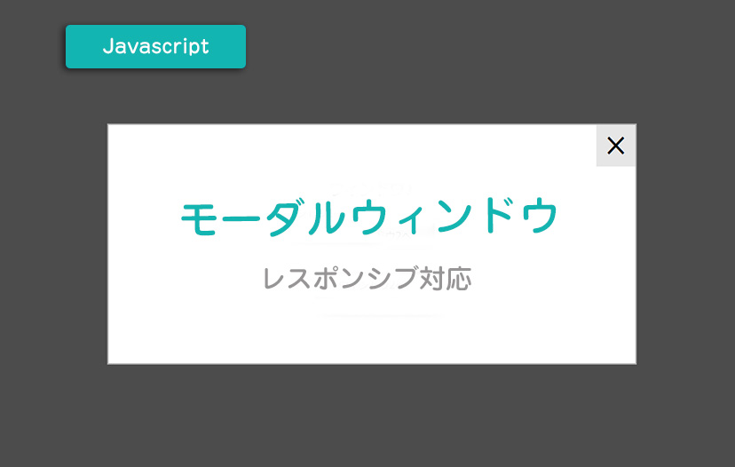
今回はレスポンシブ対応のモーダルウィンドウの作成方法をまとめてみました。
サンプルページは →→こちら
jQueryとアイコンフォントの読み込み
まず、jQueryとアイコンフォントを読み込みます。インターネット上に公開してくれているので、URLで読み込むことができます。
アイコンフォントは『Material Design Iconic Font』を使用してみました。
Font Awesomeと同じような使い方ができます。以下を参考にしてみてください。
https://www.tipdip.jp/tips_posts/production/1803/
HTMLを記述
HTMLを記述します。
HTML
ウィンドウ1</h2>
モーダルウィンドウが開きました。</p>
<a data-target="modal2" class="modal_switch"><span>ウィンドウ2へ
ウィンドウ2
あのイーハトーヴォのすきとおった風、
夏でも底に冷たさをもつ青いそら、うつくしい森で飾られたモリーオ市、
郊外のぎらぎらひかる草の波。
この様にウィンドウの高さが違う場合でも
この様に表示することができます。<a class="modal_close"><i class="zmdi zmdi-close">
『<a data-target=”〇〇” >』と対応する『<id=”〇〇”>』のモーダルを呼び出しています。
例えば、最初の『<a data-target=”modal1″>』をクリックすると『<div id=”modal1″>』が呼び出されます。
『<a class=”modal_close”>』はモーダルを閉じるボタンです。
CSS
.modal_open{
    display: inline-block;
    margin: 3vw;
    float: left;
}

.modal_box {
    position: fixed;
    z-index: 7777;
    display: none;
    width: 80%;
    max-width: 840px;
    margin: 0;
    padding: 60px 2vw 80px;
    border: 2px solid #aaa;
    text-align: center;
    background: #fff;
    box-sizing: border-box;
}

.modal_close {
    position: absolute;
    top: 0;
    right: 0;
    display: block;
    width: 62px;
    font-size: 46px;
    color: #000;
    line-height: 62px;
    text-align: center;
    background: #e6e6e6;
}

.modal_close i {
    line-height: 62px;
    vertical-align: bottom;
}

.modal_bg {
    position: fixed;
    top: 0;
    left: 0;
    z-index: 6666;
    display: none;
    width: 100%;
    height: 120%;
    background-color: rgba(0,0,0,0.7);
}

.link_area {
    overflow: hidden;
    max-width: 410px;
    margin: 60px auto 0;
    text-align: center;
}

.link_area .modal_link {
    display: inline;
}

.link_area .modal_link a {
    display: inline-block;
    width: 180px;
    color: #000;
    line-height: 2.5;
    text-decoration: none;
    margin: 0 10px;
    background: #e6e6e6;
}

.link-area ul li.modal_link:first-child a {
    float: left;
}

.link-area ul li.modal_link:last-child a {
    float: right;
}


@media screen and (max-width: 769px) {

/*  ウィンドウサイズ769px以下の時のスタイル  */

  .modal_box {
      padding: 50px 2vw 40px;
  }

  .modal_close {
      width: 40px;
      line-height: 40px;
      font-size: 30px;
  }

  .modal_close i {
      line-height: 44px;
  }

  .link_area {
      margin: 25px auto 0;
  }

  .link_area .modal_link a {
      margin: 15px auto 0;
  }

  .link_area ul li.modal_link:first-child a {
      float: none;
      margin-top: 0;
  }

  .link_area ul li.modal_link:last-child a {
      float: none;
  }

}
CSSはクローズボタンのデザイン指定やウィンドウサイズを770pxでレスポンシブ対応するよう切り替えています。
Javascript
$(function(){

  // 「.modal_open」をクリックしたらモーダルと黒い背景を表示する
  $('.modal_open').click(function(){

    // 黒い背景をbody内に追加
    $('body').append('');
    $('.modal_bg').fadeIn();

    // data-targetの内容をIDにしてmodalに代入
    var modal = '#' + $(this).attr('data-target');

    // モーダルをウィンドウの中央に配置する
    function modalResize(){
        var w = $(window).width();
        var h = $(window).height();

        var x = (w - $(modal).outerWidth(true)) / 2;
        var y = (h - $(modal).outerHeight(true)) / 2;

        $(modal).css({'left': x + 'px','top': y + 'px'});
    }

    // modalResizeを実行
    modalResize();

    // modalをフェードインで表示
    $(modal).fadeIn();

    // .modal_bgか.modal_closeをクリックしたらモーダルと背景をフェードアウトさせる
    $('.modal_bg, .modal_close').off().click(function(){
        $('.modal_box').fadeOut();
        $('.modal_bg').fadeOut('slow',function(){
            $('.modal_bg').remove();
        });
    });

    // ウィンドウがリサイズされたらモーダルの位置を再計算する
    $(window).on('resize', function(){
        modalResize();
    });

    // .modal_switchを押すとモーダルを切り替える
    $('.modal_switch').click(function(){

      // 押された.modal_switchの親要素の.modal_boxをフェードアウトさせる
      $(this).parents('.modal_box').fadeOut();

      // 押された.modal_switchのdata-targetの内容をIDにしてmodalに代入
      var modal = '#' + $(this).attr('data-target');

      // モーダルをウィンドウの中央に配置する
      function modalResize(){
          var w = $(window).width();
          var h = $(window).height();

          var x = (w - $(modal).outerWidth(true)) / 2;
          var y = (h - $(modal).outerHeight(true)) / 2;

          $(modal).css({'left': x + 'px','top': y + 'px'});
      }

      // modalResizeを実行
      modalResize();

      $(modal).fadeIn();

      // ウィンドウがリサイズされたらモーダルの位置を再計算する
      $(window).on('resize', function(){
          modalResize();
      });
    });
  });
});
フェードイン効果や背景を黒くしたり、モーダルウィンドウを画面の中央に配置する指示をしています。リサイズされる度にモーダルの位置を再計算してくれます。
サンプルページは →→こちら
参考ページ
・https://www.tipdip.jp/tips_posts/production/2090/
・https://www.tipdip.jp/tips_posts/production/1803/


この記事へのコメント